Animated Bézier curves with SVG and CSS
Once upon a time, I was creating a distribution management platform for an AVISTA product importer. This project also included a public website featuring a product catalog and company information. The initial design was clean and sleek, but we wanted to add a touch of wow-factor.

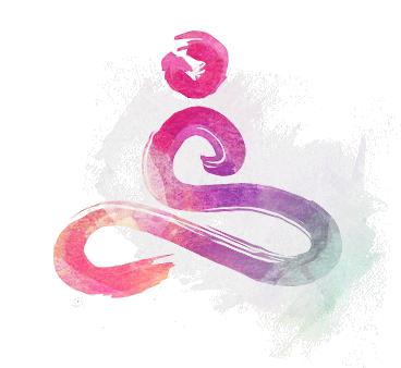
The company has several product lines and the idea was to add a graphical element based on Bezier curves that represents each product line in their respective brand colors. Moreover, I wanted these line parameters to be easily adjustable, enabling the creation of new shapes for different sections.
In SVG, cubic Bezier curves are defined by two points and two control points. By combining multiple Bezier curves, we create splines.

Drawing several repeating splines is not a rocket science as well. We simply duplicate them and shift each coordinate by a certain number of pixels. However, it's hard to call the result beautifull.

Beauty emerges when there is dynamics, dimension, and character. It becomes intriguing to explore them. This can be achieved by moving points in different directions and with varying steps, rather than linearly. Gradual changes in color are added to achieve the desired effect.

To make it easy and convenient to create new shapes, a visual editor was developed. Here's a simplified version to play with:
It's alive!
So, for the animation part, I went with this cool trick of making it look like the line is getting drawn. It gets even more awesome when you play around with different delays for each curve.
Now, let's dive into how I made this happen. It's actually pretty straightforward. The magic lies in turning the line into a dashed one, with those dashes being super long, so it covers the entire path.
.path-animated {
  stroke-dasharray: 4000 4000;
  stroke-dashoffset: 8000;
  animation: dash 10s linear forwards;
  animation-iteration-count: infinite;
  stroke-width: 1;
  animation-iteration-count: infinite;
}
All the action happens when we animate the stroke-dashoffset property.
@keyframes dash {
 to {
   stroke-dashoffset: 0;
 }
}
And here's the exciting part – if you play around with stroke styles, colors, and tweak the animation, the possibilities are practically limitless. Have fun experimenting!